Wednesday, May 18, 2011

10 Principles Essential to Making Your Website Not Suck

While being introduced to web design in Year 2 Cyberarts, the first thing that we learned were the 10 principle that are essential to having a good website.

The 10 principles essential to having a good website are:
1. Don't make users think
2. Don't squander the user's patience
3. Manage to focus the user's attention
4. Strive for feature exposure
5. Make use of effective writing
6. Strive for simplicity
7. Dont be afraid of whit
e space
8. Communicate effectively with a visible language
9. Conventions are our friends
10. Test early, test often

The best way to learn how to make a good website is to start off with looking at a bad website.


This is a great example of a bad website because it does not follow any of 10 principles that make up a good website. The website is complicated and requires the user to read and think to navigate throughout the website. While visiting the website I became very impatient and could not focus because the images and text were placed randomly and were very unorganized. As you can see, this website sucks! It does not get its message through and I for one would not even bother trying to navigate through this website.

To relieve you of the disappointment from that horrible website, I have posted a screenshot of what a good website looks like.
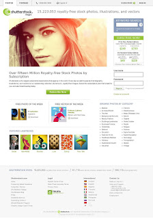

The website is very simple and easy to use. The large use of white space allows the user to look at the options available without using much thought. Also the website designer added images with lots of colour to interest the website users attention. This website is a great example of what a good website looks like and if you do not want your website to completely suck, I suggest you follow the 10 simple principles posted above.

Wednesday, April 20, 2011

Realistic Sketching

Realistic sketching involves a lot of focus and patience. For the past 3 weeks in our year 2 Cyber Arts class we practiced sketching various skulls and poses. We received a project in which we draw still-life as realistic as possible. A method that i learned to make sketches realistic was to lightly do a contour sketch and add very light shades till it goes as dark as possible from a HB pencil to a 6B. This method is hard because it involves a lot of time and patience. You have to be precise with your movements in order to prevent yourself from smudging the graphite on the paper. The goal was to make a clean realistic sketch and i feel that my work could have been improved. If i had to redo it, i would have focused more on the light shades and the proportions of the images. In the end I feel that i had done a pretty good job and was impressed with how realistic i could make an image look like.

Saturday, January 23, 2010

Driving Me Crazy


1. My Concept:


My original concept was to show how much stress students take in high school during exams. But as I started to elaborate on the concept of stress, I thought of dyslexia. I thought about how students with dyslexia feel immense amounts of stress because the words they see are flying around in their heads and are not sending clear messages to their brains. As I read about dyslexia on the internet, I found out many interesting facts. I found out about how students with dyslexia go through immense stress, feel stupid, feel lonely, feel like outcasts. As I read these articles on the internet, I thought that these emotions dyslexic people go through are very surreal. I thought I could portray these emotions in my pictures as a form of surrealist art.


2. Process:


Most of the pictures in this photograph were taken by me for example the picture of the boy in the desk ( also known as Nic, my Cyberarts friend), the chalk board and desk, the class, and the words. The picture taken off of the internet was the picture of the teacher standing. Getting these pictures was very difficult. I took pictures of Nic in the photography studio sitting on a desk. It took about 30 shots to get the perfect picture. I had to make shore the lighting was perfect, and with a little help from my Cyberarts teacher Mrs. Silverman, I got it right. The easy pictures were the picture of Nic and the blackboard. Though they did require many shots, they did not require as much work. The hardest picture to take was the picture of the classroom. Mainly because I had to make a classroom. I had to take ten desks from the photography room and place it inside the projector room where the desk and chalkboard were located. This took about fifteen minutes, luckily I had some help from my fellow classmates. After 40 minutes of setting up I managed to get almost everyone in the picture including me :), unfortunately it took a while to get the right picture, mainly because everyone was goofing off, but what do you expect right, its high school. After 20 minutes of browsing through pictures I found the ones I needed and got strait to work. Creating the picture was the hardest part. I had to cut each character out of its original picture and paste it into a new page. Cutting the pictures out was very hard because it had to be perfect, if I messed up I had to start all over again. 2 of the most difficult steps were to blend the picture of the class room into the blackboard and to make the words look like they are coming out of the chalk board. To get the classroom into the chalk board I had to try many methods like cropping, smudging, change of contrast, merging, liquifying, blurring, colour change and healing. To get it right I had to use 2 periods of class. It took long because it was my first time using photo shop. To get the words to have a wave affect I had to warp the words and change the sizes. The easy part of the words was changing the color of the words. I simply had to use the lasso tool and highlight the text. Than change the hue and saturation to make the letters black or white so they stand out. I had to do this to get my point across. By highlighting words like dyslexia, stress and difficulty reading, I got my point across to the viewer that the picture is about dyslexia and what the definition of dyslexia is. The easy pictures were the picture of Nic sitting in the desk and the picture of the teacher standing. To put Nic into the picture I simply had to cut him out of his original picture and paste him into a new page. I wanted to make the teacher look like he is in two different places at the same time, so I simply copied a picture of him, used the magic wand tool, and made an outline of the teacher, than I cut the original cutout in half, stuck the outline in a layer behind him and pasted them in front of the chalk board. To make it look like their in two different places I copied the desk and stuck it in front of the outline. After everything was on the new black page I blurred the edges of every picture so they all looked like they are real and belong where they are. The last thing left to do was to add a shadow in front of Nic. All I did was use the brush tool, drew what looks like a shadow and changed the hue, lightness and saturation to make it look real. After 1 and a half week, I was done.


3. Conclusion:


I was very happy with my overall result. I thought it was a great experience and learned a lot on a program I had never used before. I learned that I can figure things out on my own and that I can do anything if I set my mind to it. I am pretty happy with what I have and would not really want to change anything.

Wednesday, January 13, 2010

Tuesday, January 12, 2010

Racism video complete !! :D

1. The main focus of our rasicm video was to show discrimination. though we tried to focus on it, we did not reach our aim and created a big jumble of small thoughts representing racism.

2. The video gets the point across to the audiance by showing them the thoughts of our fellow students in our school.

3. The technique we used to get the point across to the audiance was to ask students to describe racism in one word. Also we crated music that started of slow and went fasted as the thought progressed about racism.

4. Truthfully I am not satisfied with our end result. I think it can be improved alot. Though I liked the shots of people we took, I think we could have made our video focus on an act of racism because that would get the message across to the people, for example people playing soccer but they do not let a kid play because he is younger. Its a form of discrimination and it would get the message across quickly. Also we could have made a rap song. Though that was our original idea, we did not suceed because we had gotten distracted and ran out of time. If we had planned out our time more wisely I think we would have succeeded but thats the past and well, there always next year.

5. I think we can improve our video by getting shots that actually do represent acts of discrimination and by improving our music alittle. Though it goes slow and fast to show alittle seriousness in the concept of rascism it can be improved to a more mellow tone because our end result was alittle happy and not as mellow.

To veiw our end result of our rascism video, go to: http://ashketchumpokemon.blogspot.com/

Tuesday, January 5, 2010

Tuesday, December 15, 2009

Sunday, December 6, 2009

Surrealism

What is Surrealism?

A 20th-century literary and artistic movement that attempts to express the workings of the subconscious and is characterized by fantastic imagery and incongruous juxtaposition of subject matter.

2. Show 3 examples of Surrealist art (listing the artist’s name)


Young Chimera / Jeune chimère. 1921. Collage, gouache and Chinese ink on paper. 29 x 9 cm


Artist René Magritte, Year 1964, Type Oil on canvas, Dimensions 116 cm × 89 cm (45.67 in × 35 in)


Artist Salvador Dalí, Year 1931, Type Oil on canvas, Dimensions 24 cm × 33 cm (9.5 in × 13 in) 


3. Pick one Surrealist artist and briefly discuss their view on surrealism.

One surrealist artist I like is Rene Magritte. The reason I like Rene Magritte is because he had a very abstract definition of life. He always made paintings that show the truth of life and man. For example his painting, The Son of Man. It was a self portrait. It was what he thought of himself. About the painting Rene Magritte said:


At least it hides the face partly. Well, so you have the apparent face, the apple, hiding the visible but hidden, the face of the person. It's something that happens constantly. Everything we see hides another thing, we always want to see what is hidden by what we see. There is an interest in that which is hidden and which the visible does not show us. This interest can take the form of a quite intense feeling, a sort of conflict, one might say, between the visible that is hidden and the visible that is present.


4. Find two examples of Surrealism in modern day photography using Photoshop (or…perhaps not using Photoshop) (list the photographer and explain if you can, how it was done)


Noname, Created by litzer:


Ther_cocoon , created by djedamrazuk

Monday, November 30, 2009

Stop Motion Animation

http://www.youtube.com/watch?v=alDP12wEE5c

http://www.youtube.com/watch?v=Ywu1DeqXTg4
http://www.youtube.com/watch?v=F9YRh0LynGE&NR=1&feature=fvwp


1. What is the main focus of the video? (i.e. the impact of prejudice, discrimination, systemic discrimination, racial slurs?)
The main focus of the video is discrimination.

2. Describe how the video gets this point across.

The video gets the point of discrimination by showing diffrent people wit diffrent shirts of colours in diffrent groups. One person from each group trys to go to another group, but the members dont let them because they are discriminating against their shirts. the video shows the left out people in another group with diffrences which shows the point that we need to stop discrimination and take a step away from it.


3. What techniques are used in the video to help convince the viewer of the point of the video. (Look at shots, music, content, text, voice, voice-over, sound fx etc.)

There is sad music, it says stand out and fight racism at the end of the video and all the shots are about acceptance and discrimination.

Friday, November 27, 2009

Wednesday, November 18, 2009

I checked out http://courses.ncssm.edu/gallery/collections/toys/html/exhibit07.htm
and saw an awsome optical toy called a Phenakistoscope. It is an instrument people used to animate with, around 1829, though it was shown to the public in 1832, it was used a couple of years before. I like the Phenakistoscope because it is not something people use these days. It was surprising to see diffrent kinds of animation techniques before computers were created. The phenakistoscope works by 2 discs ontop of each other on the same axis. When you look at the discs through a mirror in the slots, the pictures on the second disc appear to move.


Tuesday, November 10, 2009

http://ashketchumpokemon.blogspot.com/2009/11/blog-post.html#comments

Our video, for CyberARTs
This video was created by Cinan, Fasai, and Nic.
This video was based on doing three perspective shots of the same object, from different angles and diffrent things happening, about what appens infrot of one door. Using IMovie, we edited to make the slow motion effects, the sound effects, and the music. Along with cutting out parts we created the video, as a exercise .

VIDEO SEQUENCING

Video Sequencing is the foundation of every video story. Basically video sequenceing is a scene broken down to a short clip but stil delivering the same message. Instead of a 4 minute video of a person walking down the stairs out the door and into a car it would be a 10 second video showing the same thing. When video sequenceing dont pan or zoom. Just take a 10 second shot whatever. it really help. What also helps is haveing lots of b roll.


http://masteringmultimedia.wordpress.com/2008/02/14/sequencing-the-foundation-of-video-storytelling/

Tuesday, November 3, 2009


Our assignment was to edit a picture we had taken in class on photoshop and make it look realistic.
To start off I edited the gradient and made it black and white, to create a nice realistic effect. I thought it would work best because we used charcoal which is black, so basically grayscale would make it look more real. I increased the hue and the saturation. I also increased the exposure, and gamma. Finally I decreased the brightness and cropped the picture. As you can see above, this was what I had ended up with. :)

Wednesday, October 21, 2009

Thursday, October 15, 2009

CINANIME PRODUCTIONS


 CINANIME productions are the new anime. We specialize in Asian styled animations.  Anything that involves animating or cartoons, we will do.  We are always optimistic and will always finish the job on time with great quality. We have an angel on our logo because we fly above the competition and make sure that we finish the job without causing much damage to the environment. We chose an angel for our logo because angels represent dignity, glory, honor and bearers of joyful news. And because we always satisfy our customers we thought an angel would be perfect because we always bring joyful news.
My logo contains many lines. I wanted all the lines to have some sort of curve in them to make them look fun and cool. I did not leave many strait lines because I did not want it to look boring.  I chose strong bold lines to make my picture pop out and be noticed. I wanted to express that we are cool, that we are the new anime and we are now the best.
I added a mixture of warm and dark lines. I used many warm and vibrant coloures like yellow and peach to make you feel calm and steady but added a mix of dark blues and grey’s to tell you that though we are easy going, we are also very competitive and have a strong personality.
My third logo solution was very difficult to make compared to the black and white logo because I had to add colours. My second logo was easy to make because I am very good at making gray scale pictures. I do not enjoy colouring and therefore I focus more on grays. When I looked at the grayscale version it gave me a darker perspective. It showed me the dark side of the angel and how strong and bold it looked. My first solution was the easiest because it did not involve any grays or colours. It just had backs and whites, which was easy to make. But the only thing was that black and white did not really express much expression or really symbolize much.
I made my animal look towards the right because I wanted him facing the words so that when looking at the logo you notice the animal first and then leads you to who we are.
While making my logo I wanted to express strength, beauty and calmness.  Wanted to represent those certain feelings because hat is what I am about, therefore my company should also feel that way.
Out of all three of my final products I chose the 3rd logo with colour because it expresses the company the most and expresses more feelings then the grayscale one and line one. The third one is also more attractive to the eye and is more exciting.

Tuesday, September 22, 2009

Piano Maze


 The assignment was to create a rhythm where you could vary quality, type and position of the lines. In this piece I used lines with a variety of different sizes. They all go in the same direction but create an illusion. When I see this piece of work, I see three things. The first things I see are piano keys. Though it may be hard to notice. If you look between two separated thin lines, you will find a thick line in the middle, this reminds me of the black key in between white keys on a piano. The second thing it reminds me of is the picture of beats on a boom box. When you look at the small screen in the middle of a boom box, you can see many rectangles constantly moving up and down. The third thing it reminds me of is music, music because it is constantly flowing. My piece of work flows downwards in gentle zigzags. And in music the beats move from high notes to low notes. Though the beat is repetitive it still creates different sounds.

World Of Beats


09/23/09

Today I am critiquing Goya's The third of May 1814 on its imitationalism. The painting is satisfying, though it is not excellent. Compared to the Mona Lisa,it is a pile of garbage. The painting is somewhat realistic. You can see the faces of the men and their shadows though their is not enough detail to see it clearly. The colours are a little too dark for example the lamp close to the soldiers feet should have more vibrant shades. Also the shading is not done correctly. Beside the man with his hands covering his face, there is a man who's face has no shade what so ever. It is entirely one colour and should be a little darker on the left side of the face. As an imitationalism I think this piece of art is worthy enough to be called pleasing.

09/25/09

Today I am critiquing Goya the Third of May 1814 on its emotionalism. This piece is excellent. The colors are very expressive and strong. The colors are mostly dark. The painting is filled with dark shades of blue, green, brown and black. You can actually feel the grief and sudden shock of terror that the painting is showing. In my opinion this picture is very very pleasing to the eye, mostly cause it tells a story and has a strong emotional response of grief and fear. This piece is excellent.

09/27/09

Today I am critiquing Goya's the Third of May 1814 from a formalists point of view. This picture has great balance, though there is a lot of negative space on the top of the art work, it eventually tends to just go with the piece. There is a lot of texture in this piece. Especially on the soldiers on the right. You can actually see the movement and texture of the mans cloths. I do not like the fact that the artist put a lot of texture around the soldiers but I can see why, the artist wanted to emphasis the soldiers. When you first look at this picture. The first thing you see is the soldiers and then the slaves. I think the piece could have been better. If the artist had added more building, the picture would have been a little more even. Altogether this picture is spectacular.

About Me

My photo
hi, welcome 2 my blog, for those of you that know me i think you already know that i love art, if your intreasted at looking at it or buying it send me an email :) or go to the link

LAKESHORE COLLIGATE INSTITUTE